4. Creating components
With two pages comprised entirely of Carbon components, let’s revisit the landing page and build a couple components of our own by using Carbon icons and tokens.
Preview
Carbon provides a solid foundation for building web applications through its color palette, layout, spacing, type, as well as common building blocks in the form of components. So far, we’ve only used Carbon components to build out two pages.
Next, we’re going to use Carbon assets to build application-specific components. We’ll create our components with considerations for accessibility and responsiveness.
A preview of what you’ll build (see bottom of page):
Fork, clone and branch
This tutorial has an accompanying GitHub repository called carbon-tutorial-angular that we’ll use as a starting point for each step. If you haven’t forked and cloned that repository yet, and haven’t added the upstream remote, go ahead and do so by following the step 1 instructions.
Branch
With your repository all set up, let’s check out the branch for this tutorial step’s starting point.
git fetch upstreamgit checkout -b angular-step-4 upstream/angular-step-4
Build and start app
Install the app’s dependencies (in case you’re starting fresh in your current directory and not continuing from the previous step):
npm install
Then, start the app:
npm start
You should see something similar to where the previous step left off.
Review design
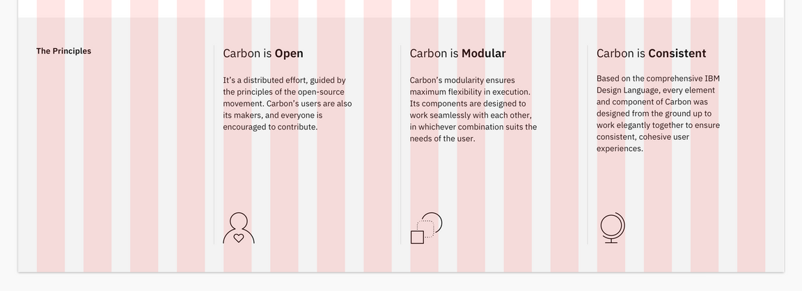
Here’s what we’re building – an informational section that has a heading and three subheadings. Each subheading has accompanying copy and a pictogram. We’ll assume that this informational section is used elsewhere on the site, meaning it’s a great opportunity to build it as a resusable component. As for naming, we’ll call it an InfoSection with three InfoCards as children.

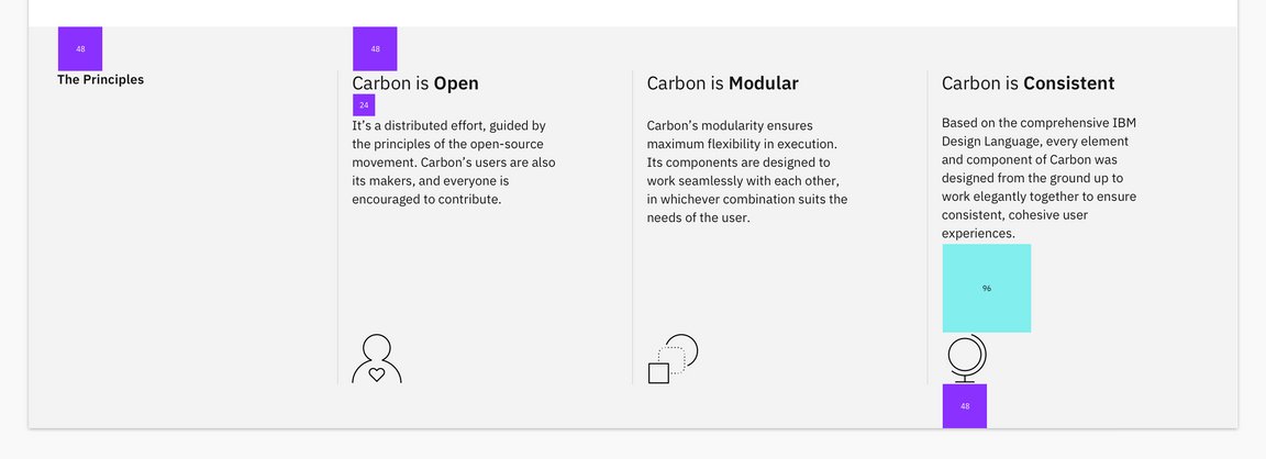
Info section layout
Create components
First we need files for the components, so create an Info folder in src/components. Even though we’re building multiple components, their names all start with Info, so it makes sense to have them share one folder in components. Create these files:
Generate modules & components using the Angular CLI
Let’s generate a new module that’ll handle our InfoCard and InfoSection components:
ng generate module info
Now we generate our InfoCard and InfoSection components:
ng generate component info/info-card --lint-fix
ng generate component info/info-section --lint-fix
Running the above commands should get you the folder structure below:
src/app/info└──info.module.ts└──info-card├──info-card.component.scss├──info-card.component.ts├──info-card.component.spec.ts└──info-card.component.html└──info-section├──info-section.component.scss
Now let’s create a JSON file that’ll include our content to be shown in the components:
src/app/info/info.json{"title": "The Principles","items": [{"heading": "Carbon is Open","content": "It's a distributed effort, guided by the principles of the open-source movement. Carbon's users are also it's makers, and everyone is encouraged to contribute."},{"heading": "Carbon is Modular",
Now we also need to tell typescript to resolve JSON files as modules when compiling:
src/tsconfig.app.json{"compilerOptions": {"sourceMap": true,"declaration": false,..."resolveJsonModule": true},...}
InfoSection component
Let’s create the parent component that includes the “The Principles” heading. That markup currently looks like this in landing-page.component.html:
src/app/home/landing-page/landing-page.component.html<div ibmRow class="landing-page__r3"><div ibmCol [columnNumbers]="{'md': 4, 'lg': 4}"><h3 class="landing-page__label">The Principles</h3></div><div ibmCol [columnNumbers]="{'md': 4, 'lg': 4}">Carbon is Open</div><div ibmCol [columnNumbers]="{'md': 4, 'lg': 4}">Carbon is Modular</div><div ibmCol [columnNumbers]="{'md': 4, 'lg': 4}">Carbon is Consistent</div></div>
We want to do a few things when abstracting it to a component. Firstly, we want to encapsulate the component’s styles within it’s dedicated stylesheet. We don’t want to include landing-page__r3 within the component template as that’s specific to the landing page. In order to allow the landing page to have access to styling this specific instance of an InfoSection component we could pass the class into the instance of the component. However, we won’t need to do any additional styling from the landing-page so we can just go ahead use the component as is.
We’ll also:
- Add component class names like
.info-sectionand.info-section__heading - Semantically use
<section>instead of<div> - Update the grid columns to match the design
- Update the component content to use
info.json - Replace columns 2 - 4 with
InfoCardcomponents - Remove class styling from
landing-pagecomponent
src/app/home/landing-page/landing-page.component.html<app-info-section></app-info-section>
src/app/info/info-section/info-section.component.html<section ibmRow class="info-section info-section__r1"><div ibmCol [columnNumbers]="{'md': 8, 'lg': 4}"><h3 class="info-section__heading">The Principles</h3></div><app-info-card ibmCol [columnNumbers]="{'md': 4, 'lg': 4}"> </app-info-card><app-info-card ibmCol [columnNumbers]="{'md': 4, 'lg': 4}"> </app-info-card><app-info-card ibmCol [columnNumbers]="{'md': 4, 'lg': 4}"> </app-info-card></section>
As you can see we’ve added instances of the InfoCard component. There is a few things that we need to do to resolve the errors in the browser. Firstly we need to update InfoModule to be able to use the GridModule. At the same time we will export the InfoSection and InfoCard components from the InfoModule so that we can use them in the HomeModule components (specifically landing-page).
src/app/info/info.module.tsimport { NgModule } from "@angular/core";...import { GridModule } from "carbon-components-angular";@NgModule({declarations: [InfoCardComponent, InfoSectionComponent],imports: [CommonModule,
We also need to import InfoModule into HomeModule otherwise we cannot use the InfoSection component within landing-page.
src/app/home/home.module.ts...import { InfoModule } from "./../info/info.module";import {BreadcrumbModule,ButtonModule,GridModule,TabsModule} from "carbon-components-angular";
Now we’re going to go into the InfoSection component to add content from info.json.
src/app/info/info-section/info-section.component.tsimport { Component, OnInit } from "@angular/core";import * as data from "../info.json";@Component({selector: "app-info-section",templateUrl: "./info-section.component.html",styleUrls: ["./info-section.component.scss"],})export class InfoSectionComponent implements OnInit {
We essentially have added a heading and items variable into the model of InfoSectionComponent, which we’ll be using later to pass content into the children components InfoCard.
We’ve also added class names that are specific to this component that we’ll target in our stylesheet:
src/app/info/info-section/info-section.component.scss@import "~carbon-components/scss/globals/scss/typography";@import "~carbon-components/scss/globals/scss/vendor/@carbon/type/scss/font-family";@mixin info-section-background() {background-color: $ui-01;position: relative;&::before {content: '';
InfoCard component
Next up we’re going to build a component for columns 2 - 4, which currently looks like <div ibmCol [columnNumbers]="{'md': 4, 'lg': 4}">Carbon is Open</div>. We’ve added the data into the parent component but we have not told snfo-section component to give any data to the InfoCard because we first need to tell InfoCard that it will have data to display. In src/app/info/info-card/info-card.component.html, add:
src/app/info/info-card/info-card.component.html<div class="info-card"><h4 class="info-card__heading">{{heading}}</h4><div class="info-card__body">{{content}}</div></div>
Now we’ve setup our InfoCard to display a heading and some content. We will setup the component .ts file to accept a heading and content input to be displayed.
src/app/info/info-card/info-card.component.tsimport { Component, OnInit, Input } from "@angular/core";@Component({selector: "app-info-card",templateUrl: "./info-card.component.html",styleUrls: ["./info-card.component.scss"],})export class InfoCardComponent implements OnInit {@Input() heading;
Finally, we’ll update InfoSection to use the new InfoCard component.
src/app/info/info-section/info-section.component.html<section ibmRow class="info-section info-section__r1"><div ibmCol [columnNumbers]="{'md': 4, 'lg': 4}"><h3 class="info-section__heading">{{heading}}</h3></div><app-info-cardibmCol[columnNumbers]="{'md': 4, 'lg': 4}"[heading]="items[0].heading"[content]="items[0].content"
Use components
Next we’re going to use Carbon Icon components in our custom components. We’re going to place the icons within the InfoCard components as children. In the InfoModule we will import the modules we need for the Carbon Angular Icons:
src/info/info.module.tsimport { NgModule } from "@angular/core";...import { PersonFavorite32Module } from "@carbon/icons-angular/lib/person--favorite/32";import { Globe32Module } from "@carbon/icons-angular/lib/globe/32";import { Application32Module } from "@carbon/icons-angular/lib/application/32";import { GridModule } from "carbon-components-angular";
Next we will use <ng-content> so that we can inject icons into the InfoCard from it’s parent component (InfoSection)
src/app/info/info-card/info-card.component.html<div class="info-card">...<div class="info-card__body">{{content}}</div><div class="info-card__icon"><ng-content></ng-content></div></div>
We also need to update InfoSection with the icon components:
src/app/info/info-section/info-section.component.html<section ibmRow class="info-section info-section__r1"><div ibmCol [columnNumbers]="{'md': 4, 'lg': 4}"><h3 class="info-section__heading">{{heading}}</h3></div><app-info-cardibmCol[columnNumbers]="{'md': 4, 'lg': 4}"[heading]="items[0].heading"[content]="items[0].content"
Add styling
We currently have the components displaying the content we created. We need to add more styling for Carbon breakpoints, icon alignments, as well as the InfoCard title styling.

Layout
Starting with layout, add the following to src/app/info/info-card/info-card.component.scss.
src/app/info/info-card/info-card.component.scss@import "~carbon-components/scss/globals/scss/typography";@import "~carbon-components/scss/globals/scss/layout";.info-card {display: flex;flex-direction: column;.info-card__heading {@include carbon--type-style("productive-heading-03");
Once you save, go ahead and resize your browser to see the responsive layout at the different breakpoints. Make sure to review these color and spacing tokens. There are also a few breakpoint mixins that may be new to you. The @carbon/layout SassDoc is a great reference to see what all is available.
Type
Our InfoCard headings have to be updated to match the specs. We need to make the last word of each heading bold. Add the below custom function (createArrayFromPhrase) to src/app/info/info-card/info-card.component.ts:
src/app/info/info-card/info-card.component.tsimport { Component, OnInit, Input } from '@angular/core';@Component({selector: "app-info-card",templateUrl: "./info-card.component.html",styleUrls: ["./info-card.component.scss"],})export class InfoCardComponent implements OnInit {@Input() heading;
This’ll allow us to still accept heading as an input to the component, but we’ll need to change the template to use splitHeading rather than heading to display our heading content.
Update the component template to use splitHeading:
src/app/info/info-card/info-card.component.html<div class="info-card"><h4 class="info-card__heading">{{splitHeading[0]}}<strong>{{splitHeading[1]}}</strong></h4><div class="info-card__body">{{content}}</div><div class="info-card__icon"><ng-content></ng-content></div>
Then, add some styling for the icons within our InfoCard component:
src/app/info/info-card/info-card.component.scss@import "~carbon-components/scss/globals/scss/typography";@import "~carbon-components/scss/globals/scss/layout";.info-card {... .info-card__icon {margin-top: $spacing-09;}}
Finally, we need styles for the InfoCard borders. We will use the InfoSection to apply styles using the children selectors. Update the InfoSection stylesheet to include styles targeting the InfoCard:
src/app/info/info-section/info-section.component.scss.info-section {... app-info-card {margin-top: $spacing-09;}// top border in only small breakpoints to prevent overrides@include carbon--breakpoint-down(md) {app-info-card:not(:nth-child(2)) {border-top: 1px solid $ui-03;
Submit pull request
We’re going to submit a pull request to verify completion of this tutorial step.
Git commit and push
Before we can create a pull request, stage and commit all of your changes:
git add --all && git commit -m "feat(tutorial): complete step 4"
Then, push to your repository:
git push origin angular-step-4
Pull request (PR)
Finally, visit carbon-tutorial to “Compare & pull request”. In doing so, make sure that you are comparing to angular-step-4 into base: angular-step-4.