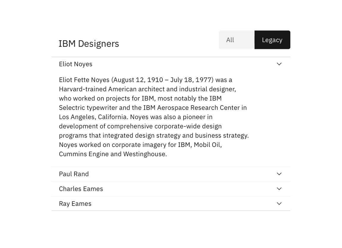
Content switcher
The content switcher is used to toggle between two or more content sections within the same space on screen. It manipulates the content shown following an exclusive or “either/or” pattern.
Overview
The content switcher is used to toggle between two or more content sections within the same space on screen. Only one section can be shown at a time.
Text
Be concise and specific. Titles have a max of two words.
Default selection
Based on usage, there should be a default selection. The default selection is always the first option in a switcher.
Live demo
Related components
Content switcher versus toggle
The content switcher is used for large groups of content, as opposed to the toggle which is meant for a “yes/no” or “on/off” binary decision.

Content switcher vs tabs
Use tabs when the content on the page is divided into related sections, but without any overlap. Tabs follow the metaphor for sections in a filing cabinet and two tabs wouldn’t contain the same sheet of paper. So the role of tabs in information hierarchy is to separate content. Use a contents switchers when you want alternative views of the same content. For example, use a content switcher if you have a single category, such as “E-mail” and you want to divide it into views such as “All”, “Read”, and “Unread”. Another example could to provide a “Preview” and an “Edit” view of the same content. In this example, tabs would emphasise that the two are distinct, whereas a content switcher better communicates that they are different views of the same thing.
Feedback
Help us improve this component by providing feedback, asking questions, and leaving any other comments on GitHub.