Loading
Loading patterns are used when information takes an extended amount of time to process and appear on-screen. Skeleton states and the loading component are two visual indicators that communicate that data is loading and that the screen is not frozen.
- Overview
- Skeleton states
- Loading indicators
- Progressive loading
- Load more options
- Accessibility
- Related
- References
- Feedback
Overview
Loading strategies assure users that their request is in progress and can create the illusion of shorter load times in apps. According to research conducted by the Nielsen Norman Group, skeleton states and other loading indicators improve user satisfaction.
In this pattern, we will look at skeleton states, loading indicators, and progressive loading.
Skeleton states
Skeleton states are simplified versions of components used on an initial page load to indicate that the information on the page has not fully loaded yet. They should only appear for only a few seconds, disappearing once components and content populate the page.

Example of a skeleton state
Skeleton states use motion to convey that the page is not stuck and that data is still being loaded. This can help to reduce user uncertainty.
Only use skeleton states on container-based components like tiles and structured lists or data-based components like data tables and cards. In most cases, action components (e.g. buttons, input fields, checkboxes, toggles) do not need to have a skeleton state.
Never represent toast notifications, overflow menus, dropdown items, modals, and loaders with skeleton states. Elements inside a modal may have a skeleton state, but the modal itself should not.
Loading indicators
Loading indicators signal a user action is processing. Unlike progress bars, loading indicators only signal that loading is occurring and do not give any indication of progress. If a process will take more than a moment or two to complete, use a progress indicator instead.
Full-screen loading indicators tell a user the entire application is processing, while inline indicators show that a specific selection or action is processing.
Full-screen loading
The loading component should be used when the entire page is processing. This is often applied after data is submitted or saved by the user.
If the process is going to take more than a few minutes, consider including a notification.
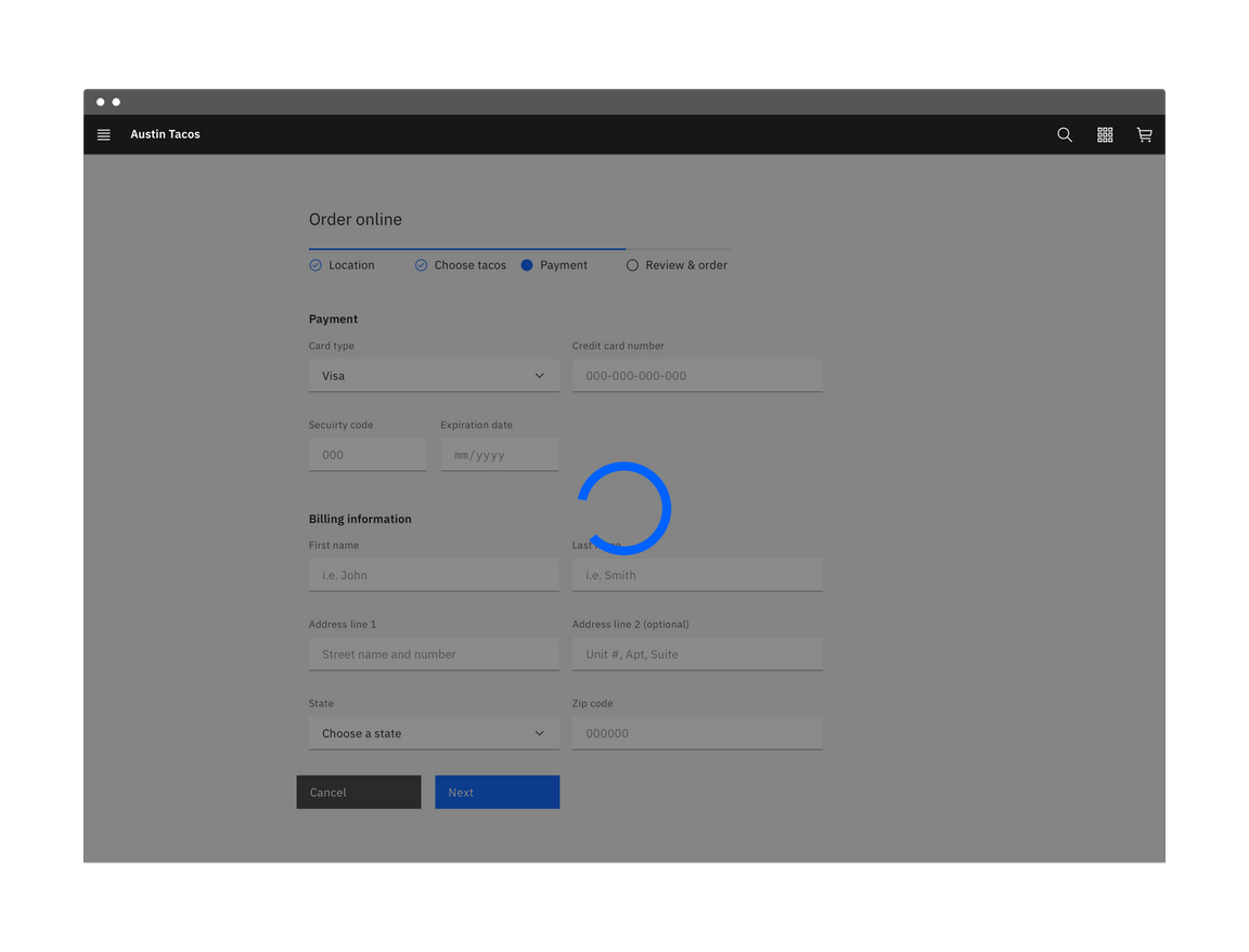
Example of a progress indicator in an application
| When to use | |
|---|---|
| An action temporarily disables the application | If a user’s action temporarily disables the application while processing occurs, use a loading indicator and a full-screen overlay. |
| Processing takes more than a few seconds | If a loading process will require the application’s full resources and will take longer than a moment or two, use a full-screen loading indicator. |
| Data from user input is being saved or submitted | Saving data following with user input often takes a few moments. Using a loading indicator allows the application to finish processing before allowing the user to continue. |
Inline loading
Use the inline loading component when a single component is processing. For example, when an administrator invites a user, an inline loading component indicates the system is processing the invite request.

Example of an inline loading indicator
Progressive loading
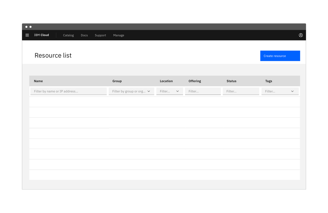
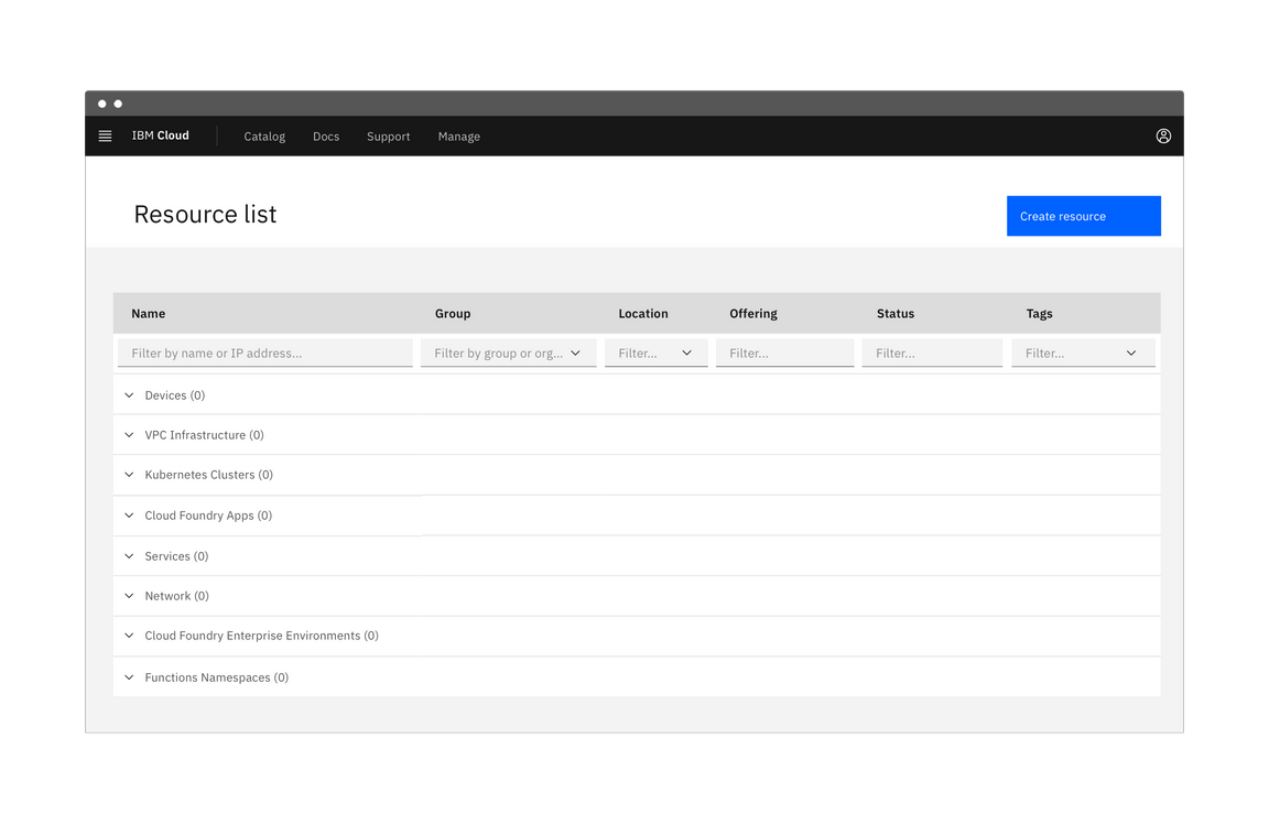
Progressive loading is a technique that loads pages in batches. The simplest view of the page loads first, followed by progressively more detailed batches until the entire viewport has loaded.
The primary batch should show a page’s basic structure (the skeleton state versions of the container-based components), data-based text (the skeleton state version of text) and non-data text. Following batches can include images, content outside of the viewport, interactive (action-based) components, and data-based text.
Not all items need a skeleton state and instead can be expressed as negative or white space until they load. For example, a 600 x 600px image can be shown as a 600 x 600px area of white space until the full image loads.
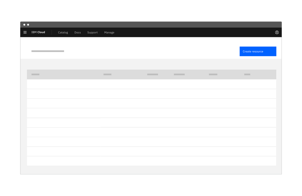
Phases of progressive loading
| When to use | |
|---|---|
| A page view is slow to load | Pages that source data from multiple sources, such as dashboards, and can be slow to load. |
| A user changes filters or facets in a table view | Tables may be sourcing information from large data sets and so processing may take a few moments. |
Load more options
A Load more option can be used to extend a list where only a small fraction of options are displayed. It can also be used in cases where the list of options is populated via a database. Using Load more allows the data to load in progressive batches.
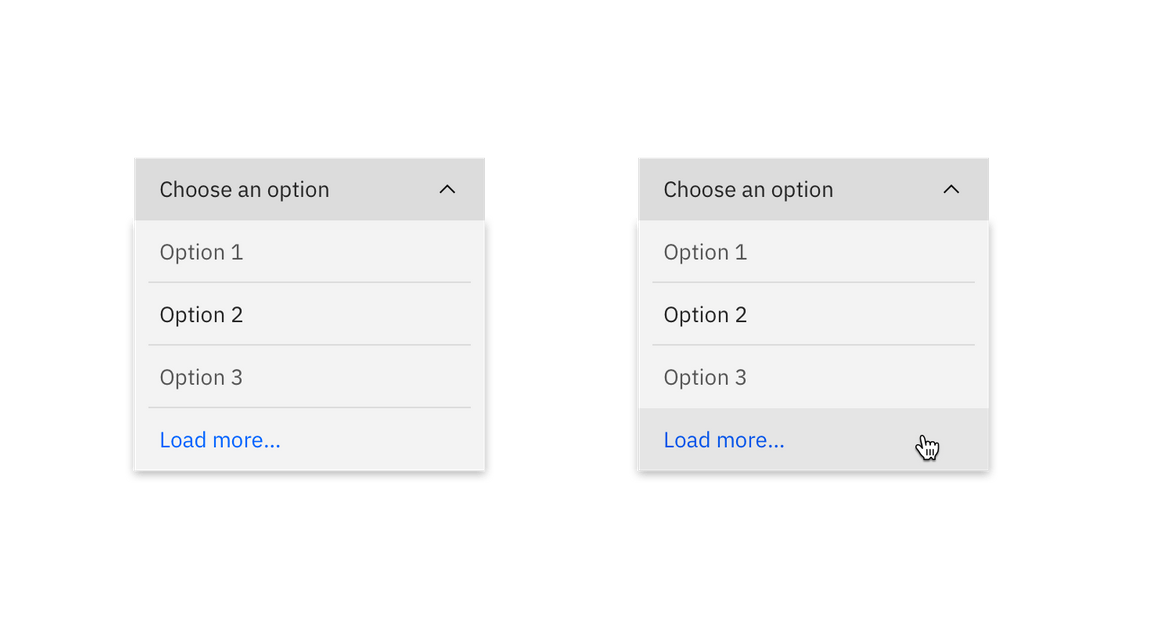
Example of Load more
Accessibility
A screen reader should notify a user if an application is loading, busy, gets stuck, or if a process fails.
For specific loading accessibility concerns, see the WCAG documentation for Notification of Loading/Busy and adhere to accessibility guidelines for the loading component.
Related
Components
Patterns
References
- Bill Chung, Everything you need to know about skeleton states (Medium UX Collective, 2018)
- Jakob Nielsen, Progress Indicators Make a Slow System Less Insufferable (Nielsen Norman Group, 2001)
- Web Content Accessibility Guidelines, Notification of Loading/Busy (W3C, 2016)
Feedback
Help us improve this pattern by providing feedback, asking questions, and leaving any other comments on GitHub.