Basic charts
Basic charts offer a way to visualize data sets in an intuitive, easy to understand way. Every chart should tell a story and should reflect the content on the page where it is found.
Resources
Area
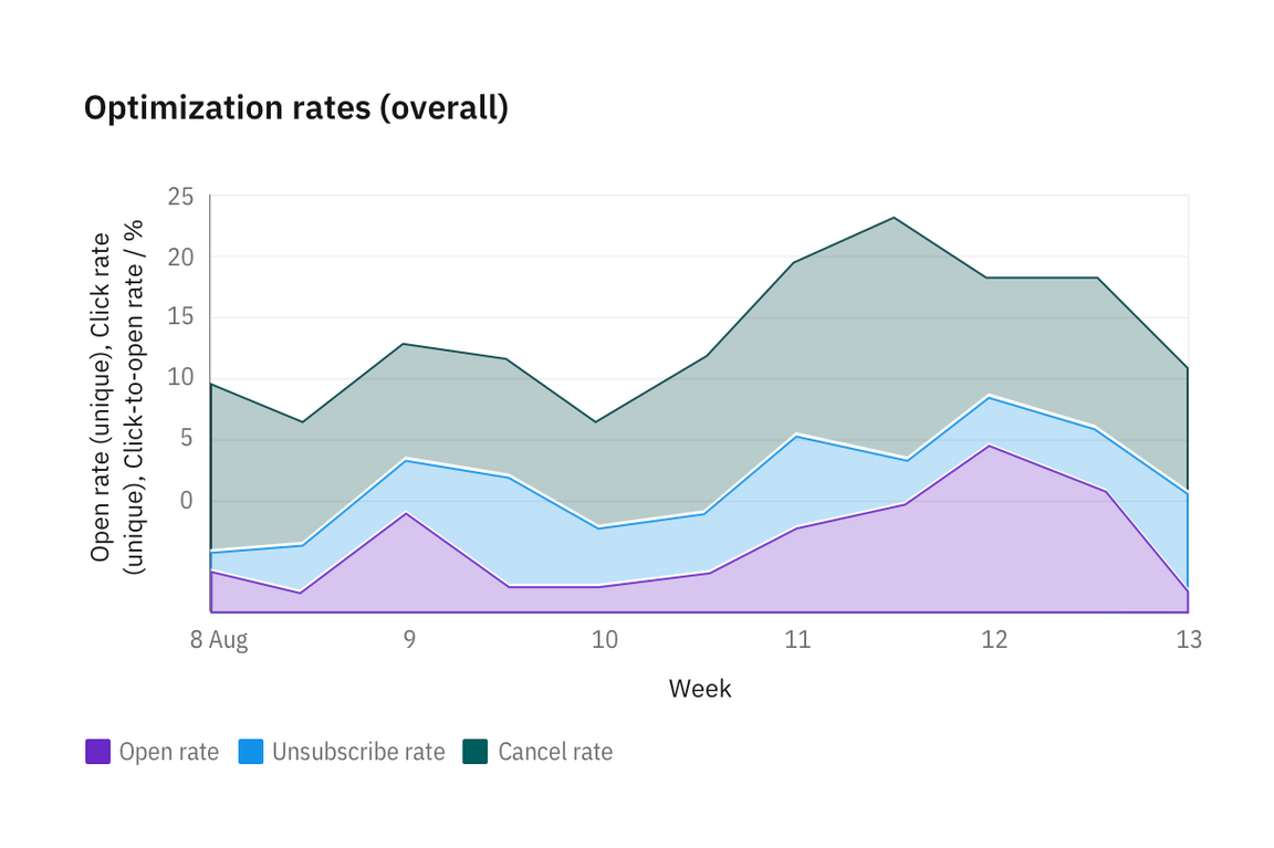
Area charts are similar to line charts, but the areas below the lines are filled with colors or patterns. Stacked charts are useful for comparing proportional contributions within a category. They plot the relative value that each data series contributes to the total.
Bar (vertical)
Bar charts use vertical or horizontal data markers to compare individual values. You can use them to compare discrete data or show trends over time.
A grouped bar chart, also known as a clustered bar graph, multi-set bar chart, or grouped column chart, is a type of bar graph that is used to compare values across multiple categories.
Stacked bar charts are useful for comparing proportional contributions within a category. They plot the relative value that each data series contributes to the total.
Bar (horizontal)
Bubble
Bubble charts use data points and bubbles to plot measures anywhere along a scale. One measure is plotted along each axis. The size of the bubble represents the third measure. You can use bubble charts to represent financial data or any data where measured values are related.
Donut
Line
Line charts plot data at regular intervals connected by lines. You can use line visualizations to show trends over time and compare several data sets.
Pie
Scatter
Scatter plot visualizations use data points to plot two measures anywhere along a scale, not only at regular tick marks. You can use scatter plots to explore correlations between different measures.
Step
Stepped line charts plot data at regular intervals, forming a series of steps between data points. You can use line visualizations to show trends over time and compare several data sets.
Radar
Design-only
Stacked area chart
Stacked area charts are useful for comparing proportional contributions within a category. They plot the relative value that each data series contributes to the total.

Meter and gauge
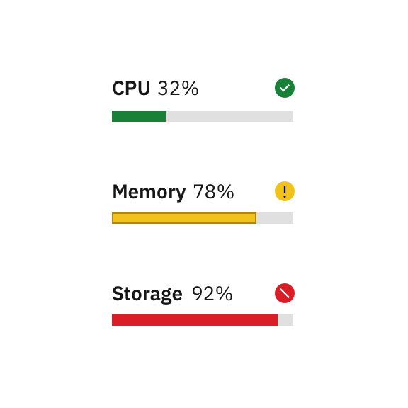
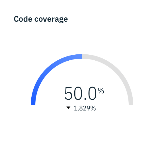
Meter and gauge charts are useful for showing values between a small number of variables either by using multiple markers on the same meter or gauge or by using multiples of the chart.

Meter charts can represent data with current value, minimum and maximum, and peaks or averages.

Gauge animates to the current value when dashboard loads to create emphasis.